/

Monday, 22 March 2010

CA Asbestos Services

Recently (actually a few months ago, but I have only now been given permission to include it on my blog) I was asked to re-design the identity for a business originally called 'Clean Air Analytical Limited'. (Now C.A. Asbestos Services).

Below you can see the old logo, dated and lacking in professional expectations.


The client had decided this needed updating, along with new design for all their stationary.

Here are 3 versions I proposed (the middle one being the chosen logo):


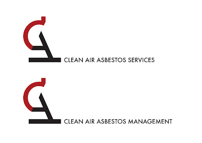
The idea behind the new logo was to highlight the companies beliefs in precision and accuracy as well as clean cut professionalism.
The C & A were used in 'Futura' typeface to build the mark and have been combined to create the shape of a microscope, the main tool used in their work.

Here is the final logo shown in two forms. This was before the client had decided on a final name, it was a toss between the two below. Obviously the upper of the two was eventually chosen.

Monday, 15 March 2010

'Low ink' update

Due to the growing popularity of my 'Low Ink' pillows I have now made the same prints available as totebags over on Envelop. Each bag is only 19.99 euros (roughly $27.42).

I hope people find these as stylish as the pillows (and maybe more useful).

(Due to computer trouble I am unable to place images here but I shall have it sorted soon).

Tuesday, 9 March 2010

'Low Ink' Pillows

Here is my latest collection of pillowcases entitled 'Low Ink', inspired by the frustration of your printer ink running low at critical moments of print.

Recently featured on the blog run by designer Laura Sweet, 'If It's Hip, It's Here' and has been getting a fair amount of attention. Thanks again Laura.


Wednesday, 3 March 2010

Magic sprouts!

On my bus ride home today I over-heard a young boy, sitting with his mum, shout out the words

"Magic Sprouts!"

Although I thought this was a bit strange it amused me and made me think of the stories his mother might have told him to encourage vegetable eating.

Thursday, 25 February 2010

What Type Are You?

Try this experiment on the Pentagram website to find out what typeface you more resemble.


My score told me I was most like Marina Script.

Saturday, 13 February 2010

...and the rest.

The fish and chip shop of the year award is highly regarded in the fish and chip trade so the design for a pictogram to represent it had to show elegance and superiority as well as give off the traditional feel people have come to love.
My initial ideas shown below were based on the idea of one fish being separated from the rest to suggest it was 'better' or a 'winner', however after a critique session I came to realise that although it made sense in my thinking, it wasn't immediately clear to others.

The idea I have chosen to pursue now involves the 3 elements (smells) that to me capture what fish and chips is all about. The vinegar, salt and pepper.
Using these elements I composed a pictogram showing them in the form of a winners podium with 3 levels of superiority (what I was looking for earlier).

This new pictogram is much clearer and communicates the idea a lot clearer than the previous did.


Coming to the end of the project...

As I am coming to the end of my current project involving the redesign of the SeaFish logo and a pictogram to represent the 'Fish & Chip shop of the year awards' I would like to show you my progression and how I reached my end result. Here is the work below.

The final logo represents the authority and precise action taken by SeaFish. The stylised 's' and 'f' echo the waves of the sea and stand out in the blue colour to differentiate them from the rest of the logotype.
The typeface used is Univers 59 Ultra Condensed, I chose this because it holds a lot of strength even in lower case, but without the wideness some typefaces come with. The negative space between the stylised lettering and the Univers suggest subtle fish shapes which adds to the underlying message of the brand.