
Below you can see the old logo, dated and lacking in professional expectations.

The client had decided this needed updating, along with new design for all their stationary.
Here are 3 versions I proposed (the middle one being the chosen logo):

The idea behind the new logo was to highlight the companies beliefs in precision and accuracy as well as clean cut professionalism.
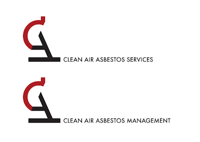
The C & A were used in 'Futura' typeface to build the mark and have been combined to create the shape of a microscope, the main tool used in their work.
Here is the final logo shown in two forms. This was before the client had decided on a final name, it was a toss between the two below. Obviously the upper of the two was eventually chosen.
A good Asbestos Services provider have to provide management survey,demolition survey and periodic condition reviews.
ReplyDeleteI'm sorry Steve, but what does that have to do with the design? It fills the clients requirements.
ReplyDelete