I have further revised the design of the 'Mark & Form' cover, including the spine and back cover, which specifies the paper and printing methods used.
I have adjusted the colours to allow for ease of screen printing the front cover, I have also decided the new two colour scheme has more impact than the previous cover.
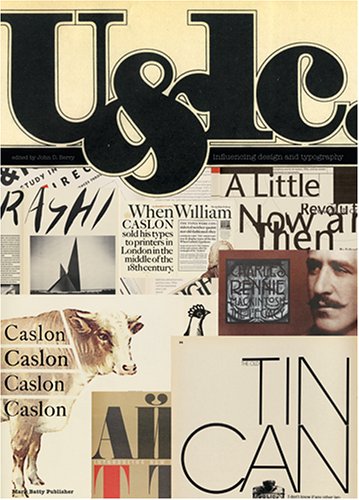
The logo in the top left has been down-sized to stop it distracting from the cover image.
After a much appreciated critique with one of my tutors and fellow students, I have decided to work further on both the 'square grid' and the 'stacked Helvetica' logo ideas as they are the strongest.
My favourite being the latter I am very excited to explore its possibilities and develop my ideas through to a final solution.
A fourth logo idea for my magazine 'Mark & Form'. This idea was born on paper as a pencil drawing when experimenting with stacked letterforms.
In Helvetica Bold this mark is strong, contemporary and holds it's own very well, it can easily sit in a corner or central in a masthead, and shows power as well as excitement.
I have more variations which will be posted in due course.
Yet another idea for the identity for my magazine entitled 'Mark & Form'.
After some feedback about my last idea, suggesting it was difficult to read (and looking at covers of old U&lc magazines), I went down a new road, however keeping in mind the grid structure I was trying to capture before.
This time I wanted to capture the delicacy of the serif letters, but still keeping a contemporary and structured feel. The letters have been partially sliced to create a geometry style which I feel reflects the magazine and what it's content will be.
Here is a folder I have designed for Sheffield Hallam University, which will be produced as a tool for all undergraduates using the faculty of 'Arts, Computing, Engineering and Sciences' 2010/11.
It will house all their induction information and keep it organised.
The design uses words that end in 'aces' which all relate to an area of the faculty, this creates a connection between each course and captures them as a family within their faculty.
I'll post again when production is completed in September of this year so it can be seen in use/context.
This is another idea I had for the identity of my magazine. The above shows it in the grid it was constructed in, which personally I like as a feature of the design. It captures the essence of the mark and ultimately shows the process, which would suit the magazine perfectly.
The lower shows the same mark, but without the grid. This seems less interesting, however it is still a nice composition.
A poster designed by Sagmeister Inc. for paper company 'Neenah' in which they were only allowed to use a single punctuation mark. Obviously they chose the apostrophe and I must say it looks fantastic, the hand printed feel also compliments the idea. Quoting Sagmeister, "[this] apostrophe is in the letter elimination business".
Here is an idea for the identity of a magazine I am developing for my latest project.
The title of the magazine is 'Mark & Form' and the content is based on identity design and branding.
This mark is constructed from the shape of the ampersand (Futura Medium) and a lowercase 'k' which I have drawn to fit with the shape of the symbol. It joins the two together in the name 'Mark & Form' (mar'K&'form).
This creates an interesting connection between the words and allows for a unique mark to represent the publication.
The title is set in Avenir 65 Bold alongside the mark to echo it's strength and cleanness. Colour is undecided at the moment, as is the identity really, but here is my favourite solution so far.
Fives & zeros catalogues the works and thoughts of myself, Thomas Dabner, a graphic designer in Sheffield who strives to create exciting work of the highest quality in identity design and typography.
[If you would like to hire me for identity design/branding, email me at quote_me@fivesandzeros.co.uk]


