After quite a wait I finally had the time to screen print the cover for my new notebook for 2010. Unfortunately due to a much more awkward process than I was an expecting (due to book thickness and very fine type), this project will remain a one-off for now.
Wednesday, 29 September 2010
Thursday, 23 September 2010
New work: Clean Air Asbestos Services
Following the identity design and rebranding for Clean Air produced back in December 2009, I was asked to design a report cover and a new company brochure outlining exactly what they do and how they go about it, which I decided to title accordingly: This is what we do and how we do it.
Along with this I also designed a completely refreshed livery for the company transport.


Labels:
brochure,
Clean Air Asbestos Services,
identity,
print,
stationary
Tuesday, 14 September 2010
Celebrating the Vignellis
The Vignelli Center for Design Studies is set to open up it's doors on September 16th and is situated at the Rochester Institute of Technology, Rochester, New York.


Read the full article on Design Observer who are also featuring a whole selection of articles on both Massimo and Lella Vignelli in a celebration of over 40 years of influential design practise.
Wednesday, 8 September 2010
245 Tenth
I discovered today that on October 1st Pentagram will be welcoming their newest partner to their New York offices. Eddie Opara will be the newest partner since Luke Hayman in 2006. Opara will also be bringing his team from the studio he started in 2005, Map Creative.


Upon reading about his move to Pentagram I decided to check out Map's portfolio and one project particularly caught my eye, and even spark one of those "I wish I had designed that" moments.
The logo, stationary and book they designed for 245 Tenth, a building on Tenth avenue, NY designed by architect and interior space designer Della Valle Bernheimer. The identity by Map was influence by binary data and black and white barcode systems, I think it is gorgeous. It is very geometric, but also abstract looking with strong horizontal marks of vary shades of black and grey, however it clearly represents the number 10.
The mark also reflects the structure and design of the building itself which is made up of a multitude of rectangles of glass, some mirrored and others transparent.
A very well executed identity, at the moment I can't take my eyes off it. See the full design here.
Interview with Eddie Opara on Co.Design blog.


Labels:
identity,
Map creative,
Pentagram,
print,
stationary
Monday, 6 September 2010
Business Cards
I am experimenting with the idea of re-branding myself, keeping the logo, but producing new stationary (business cards, mailers etc) and possibly redesigning my website when I get the chance although that may have to wait a while.


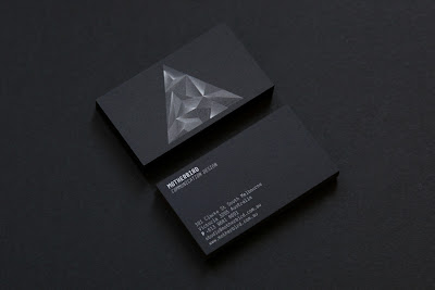
When I stumbled upon these beautiful cards from the Australian design studio, Motherbird. White on black looks so striking!


Labels:
business cards,
Motherbird,
stationary,
studio
Subscribe to:
Posts (Atom)


