As the university year draws to a close, it's time for the final year degree shows to open across the whole of the United Kingdom. Last week I had the opportunity to visit such a show taking place at the University of Hertfordshire, in Hatfield.
I had not visited a final year show up until this point, so my excitement was mounting all through my journey there and upon arrival I was almost bursting just thinking about all the wondrous talent I was about to take in.
Right from the beginning the layout and approach was spot on in my opinion, colourful fluorescent signage in bold Helvetica allowed for easy navigation with the letters signifying the building and the numbers, the sections. A beautifully presented map was also provided to allow for minimum confusion when navigating around the exhibitions.
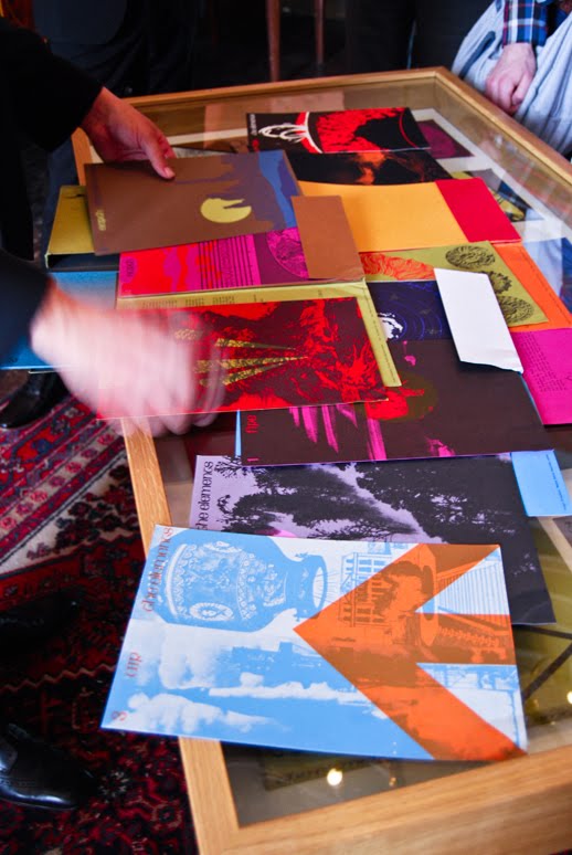
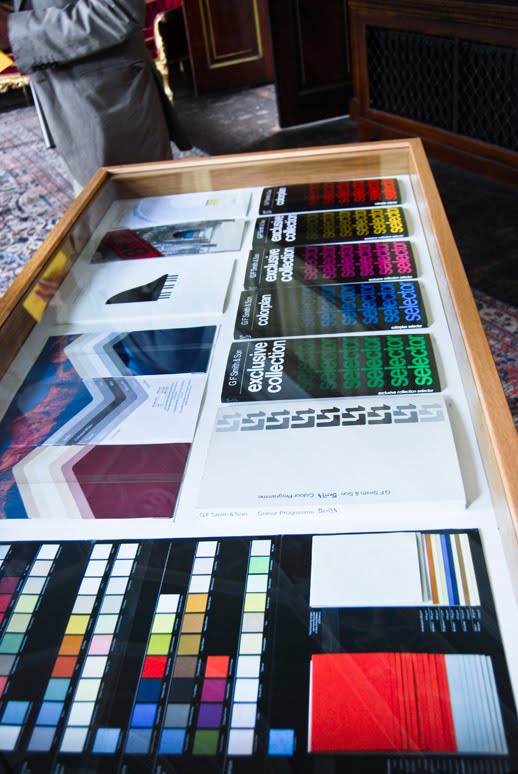
Once in the section devoted to the graduating Graphic Design students, I became engulfed in white space which was home to both wall and table displays of the work, some extremely delicately positioned and others less so due to the nature of the pieces, none the less it was all (or mostly) fantastic.
The work on display ranged through all sorts of mediums from print in it's most well known form to more diverse processes such and laser cutting and even engraving onto mirrors which was particularly interesting.
From what I cold make out, all the students had been given the same briefs throughout their final year, yet were given free reign on how they went about answering them. I thought this process was very close knit and must have allowed for interesting comparison between different students work. This differs from how my final year is run in which we self direct and write the majority of our briefs.
I was very impressed with the quality of the work on show, both the ideas and the production of most pieces had clearly been considered before making their final decisions, which to me is an invaluable asset within graphic design work. An idea, however strong it may be, can always drop a few pegs if it hasn't been carried out at the highest quality through each step of the design process.
My 'project of the show' has to be the poster exploring the value of 100 by Jonny Flynn which looks at the strength of currency across the world and how each one consists of "subdivided units of 100". The statistics used were collected on 1st December 2009.
The poster itself holds huge impact on the viewer before they even discover it's nature and purpose, the striking lettering which staggers across the shape of the continents in a multitude of sizes excites the eye and sends it on a cultural journey through currency and power.
Truly inspiring and a fresh look at information graphics.
I must admit Jonny is a personal friend of mine, but I can honestly say this did not affect how I viewed the work. In fact it also won one of the sparingly issued Stephen Twyford 'Cream of the Crop' awards, proving it's genuine quality.
Alongside the work, the designs for the promotion of the event was equally interesting and I feel deserves mentioning (shown at the beginning of this post). The theme throughout each piece of stationary consists of missing letters in the titles, however each piece has different letters missing which adds to the depth of the promotion.
Before I end this post I want to praise the numerous creative business cards I picked up during my visit, each one was a small insight into their respective designers both visually and personally. I have featured one in particular which I found simple, yet perfectly witty in the photos in the previous post.
I thoroughly enjoyed my visit to the graduate show and no doubt I may return again next year to view the work which will then be parallel to the maturity of my work, giving me a means for comparison.