/

Friday, 3 December 2010

New blog

I have moved my blog over to www.fivesandzeros.co.uk/blog and from the link on www.fivesandzeros.co.uk

The blog now has a much cleaner layout and runs more smoothly with formatting etc. I will aim to post more often, particularly of my own work. I hope you join the blog at its new home.

This Blogger address will no longer be in use.

Thursday, 2 December 2010

Corrugated card logos


However time consuming these corrugated card logo constructions may have been, they are certainly a brilliant sight. The detail is flawless to say the least. I wish they were for sale, the striking Kellog's K bursting from the wall would make my day every time. These constructions are made by 'Cardboard artist' Mark Langan, see the rest at 1800 recycling.

Wednesday, 1 December 2010

Staircase storage

kuostaircasewithperson.gif

This clever concept for stacked storage is the creation of Danny Kuo, who describes it thus:

"The most efficient way to build is vertically. Building vertically saves space as it uses minimal ground square meters. When it comes to interior design, the same rule can be applied. By focusing on height rather than width, efficient storage designs can be created. However, high storage designs can create a new problem because the higher storage parts will be difficult to reach. My Staircase is a shelving unit that combines a bookshelf with a pullout stair system in the bottom three shelves. The shelving unit is 2.6 meters high and the top shelves are accessible by using the bottom shelves as steps for accessing the higher shelves." Staircase by Danny Kuo

Monday, 22 November 2010

S.I.A Gallery

Examples of the way finding sign system to be employed at the Sheffield Institute of Arts Gallery.
A few months ago I was asked to design a sign system that would attract new visitors to the gallery as well as helping them navigate it, due to it being rather complicatedly laid out.

The system utilises large colourful arrows alongside black Gotham Bold type. All signs will be applied in vinyl as the gallery only has a small budget and will flow smoothly throughout the building.


Thursday, 4 November 2010

Ralph Caplan interview with Debbie Millman

Former editor in chief of i.D. magazine Ralph Caplan speaks to Debbie Millman about being kicked out of high school, working for Industrial Design and the difference between making things right as a designer as opposed to making things nice.

Listen to the podcast interview at Design Observer.

Wednesday, 3 November 2010

Triangular design manifesto

This manifesto by Conceptual Devices is beautifully witty.

00_ Design should not be based on formal principles – but always on an idea of society.
01_ Designed forms represent possible social orders and a lot of their contradictions.
02_ Design is everything. Anything could be designed. Everyone is a designer.
03_ Design allows social innovations. Often it is not made by designers.
04_ Design has not scale. It could be small and have great impact.
05_ Design is not an innocent practice. Designers are wicked.
06_ Design should engage people and interact with them.
07_ Design is an interdisciplinary applied science.
08_ Design produces visual consciousness.
09_ Design is a triangular manifesto.
10_ Design makes you smile.
11_ This is the top.
12_ Enjoy!


Tuesday, 2 November 2010

Typographic wallet


This is a wallet I have made aimed at typographic minded people. It is made completely of duct tape and is part of a quick Entrepreneur project as part of my final year at Sheffield Hallam University.
The wallet is for sale at Etsy for $8 here. They are made to order and can contain any lettering you like, but only a maximum of 2 letters (one for each side) in any colour.
The wallets are extremely durable and contain 4 credit card slots, one clear I.D. slot, 2 sections for notes and 2 hidden pockets for loose change. Although these types of wallets are available quite widely, mine are custom made and aimed specifically at designers. Soon to come in white as well.

Monday, 18 October 2010

Project work 2010/11

I have decided to pursue 2 main projects this year as part of my final year of university. The first came as a result of being asked to design a new way-finding signage system for the Sheffield Institute of Arts gallery. I was approached at the end of the summer period following the production of the folder for the SHU faculty of ACES, with the request to design a new system to entice people into the gallery space and how to navigate towards it, due to it being rather non-descript and hard to find.
The other project will be an identity redesign for Browns fashion in London, which is a fictional brief. This project will focus on refreshing their current identity and applying it across a plethora of media, particularly packaging, which I want to use as an opportunity to really express the brand. Similar to how Michael Bierut achieved this with Saks Fifth Avenue.

Work in progress to be featured in the coming days.

Monday, 11 October 2010

Crap(Gap) up your logo


Join in the controversy currently sweeping the design and internet world regarding the new Gap logo at CrapLogoMe

Thursday, 7 October 2010

A pointless task


After a morning discussion with Ian Anderson, founder of the Sheffield based design studioDesigners Republic, a group of us (Sheffield Hallam final year graphic design students) were given the task of performing something completely pointless for an hour and to document our findings.
Examples of pointless tasks given were throwing a penny over a balcony every minute, riding the bus to a destination of no importance and back, and sharpening pencils for 60 minutes. All very pointless to a degree.
The task I thought up involved filling in the counters of every letter (well, the ones with counters) from a article I found on Design Observer entitled "Malcolm Gladwell is #Wrong" which makes reference to Twitter. I chose this article simply because it was the newest one added. This turned out to be more of a laborious task than I had first anticipated, I documented my progress by photographing it every 5 minutes.

We are to make a 10 minute presentation tomorrow afternoon, with the aim to convince the rest of the group that the task completed was in fact utterly pointless. I'm not sure at the moment what this will achieve, but as the overall theme is based on communication I expect it will improve our presentation skills and out ability to "sell" our ideas to clients.

My findings from this experiment concluded that after 60 minutes of filling in the counters I covered 48 lines of type, I filled in a total of 1246 letter counters, there was an average of 26 counters per line and finally that both my wrist and eyes ached after.

Monday, 4 October 2010

My horrible logo

I have just seen my taylor made horrible logo which only cost me a grand total of $5 over at www.horriblelogos.com It's truly disastrous. Have your own made and get a link to your website.

Wednesday, 29 September 2010

Notebook for 2010/11 academic year

After quite a wait I finally had the time to screen print the cover for my new notebook for 2010. Unfortunately due to a much more awkward process than I was an expecting (due to book thickness and very fine type), this project will remain a one-off for now.

Thursday, 23 September 2010

New work: Clean Air Asbestos Services

Following the identity design and rebranding for Clean Air produced back in December 2009, I was asked to design a report cover and a new company brochure outlining exactly what they do and how they go about it, which I decided to title accordingly: This is what we do and how we do it.
Along with this I also designed a completely refreshed livery for the company transport.


Tuesday, 14 September 2010

Celebrating the Vignellis

The Vignelli Center for Design Studies is set to open up it's doors on September 16th and is situated at the Rochester Institute of Technology, Rochester, New York.


Read the full article on Design Observer who are also featuring a whole selection of articles on both Massimo and Lella Vignelli in a celebration of over 40 years of influential design practise.

Wednesday, 8 September 2010

245 Tenth

I discovered today that on October 1st Pentagram will be welcoming their newest partner to their New York offices. Eddie Opara will be the newest partner since Luke Hayman in 2006. Opara will also be bringing his team from the studio he started in 2005, Map Creative.
Upon reading about his move to Pentagram I decided to check out Map's portfolio and one project particularly caught my eye, and even spark one of those "I wish I had designed that" moments.
The logo, stationary and book they designed for 245 Tenth, a building on Tenth avenue, NY designed by architect and interior space designer Della Valle Bernheimer. The identity by Map was influence by binary data and black and white barcode systems, I think it is gorgeous. It is very geometric, but also abstract looking with strong horizontal marks of vary shades of black and grey, however it clearly represents the number 10.
The mark also reflects the structure and design of the building itself which is made up of a multitude of rectangles of glass, some mirrored and others transparent.
A very well executed identity, at the moment I can't take my eyes off it. See the full design here.
Interview with Eddie Opara on Co.Design blog.

Monday, 6 September 2010

Business Cards

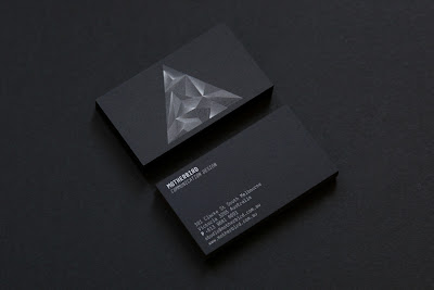
I am experimenting with the idea of re-branding myself, keeping the logo, but producing new stationary (business cards, mailers etc) and possibly redesigning my website when I get the chance although that may have to wait a while.
When I stumbled upon these beautiful cards from the Australian design studio, Motherbird. White on black looks so striking!

Tuesday, 24 August 2010

Great design

"Great design does not come from great processes, it comes from great designers"
Fred Brooks.


Re-blogged from SwissMiss.

Thursday, 12 August 2010

Birthday cards

Here are two birthday cards I have designed recently for my sisters' birthdays.
You may notice they both use Helvetica bold.

The first is my favourite of the two, based on a poster designed to promote Helvetica back in the 60's, it stacks the lettering and blocks in the V shaped counters of the Y in red creating an instant interest point. I am planning to screen print this card and have it for sale on Etsy soon.

The second is a lowercase dot to dot B which is a fun and unusual idea for a card, it can be completed or left alone. (This was the inspiration for my A B C pillows).


Tuesday, 10 August 2010

Notebook cover


Following my previous Notebook cover series, I have designed this cover which I am hoping to screen print and have for sale as full notebooks on Etsy in the coming months. The notebook may or may not be ring bound but the image above shows how the print will look.
It is also possible that I will print a few colour variations using ready mixed ink, so the possibilities of colour are totally random.

ilovebook.nl

Just stumbled upon this beautifully minimal website ilovebook.nl who sell the simplest, yet the most charming notebooks and diaries. Each uses little or no type on the covers which are available in different materials from kraft paper to leather.
Diaries feature stunning little calendars set in Helvetica in the deepest black colour. I want them all!
The books are all handmade creations from Dutch graphic designer Marjolein Delhaas.

Tuesday, 3 August 2010

Dot to dot to dot


A new set of pillows available to buy on my envelop shop. Each pillow makes up either the letter a, b, or c in lowercase Helvetica Bold. Join the dots to complete the image, or leave as is for an abstract designy feel.

Saturday, 31 July 2010

Seeing Positives

I admit I haven't had much work to show you lately due to being in the middle of two client projects, due to be finished soon and they will be up for you to see.

For now though I do have a small piece of work to show, a poster I have designed as part of the Positive Posters Project based in Melbourne, Australia.
The competition is held annually between July and October. They give designers two months to create and submit a positive design that responds to the theme of that year. An exhibition is held of the top 30 posters, and the winner chosen by a group of international judges. They then print 4000 copies of the winning poster and paste it all over the streets of Melbourne, Australia. And send a few off around the world too!

This years brief:

"I haven’t failed; I’ve had 10,000 ideas that didn’t work 
– Benjamin Franklin

We think Mr. Franklin had a nice way of looking at things. So the 2010 competition theme is ‘A Glass Half Full’.
 For those who don’t know, this saying refers to optimism. Some people see situations with optimism (Franklin – glass half full), and some see situations with pessimism (glass half empty)."

Here is my poster, see it larger here and here


Monday, 26 July 2010

I'm Comic Sans, Asshole

Below is an article written by Mike Lacher that I found in the current issue of Creative Review, re-printed from the original source over at McSweeney's blog.
As much as I am one of the 'pretentious buzz kills' referred to in the piece, I still find this article brilliantly amusing. But it must be noted that I will never retreat to the dark side that is Comic Sans.

Enjoy:

Listen up. I know the shit you've been saying behind my back. You think I'm stupid. You think I'm immature. You think I'm a malformed, pathetic excuse for a font. Well think again, nerdhole, because I'm Comic Sans, and I'm the best thing to happen to typography since Johannes fucking Gutenberg.

You don't like that your coworker used me on that note about stealing her yogurt from the break room fridge? You don't like that I'm all over your sister-in-law's blog? You don't like that I'm on the sign for that new Thai place? You think I'm pedestrian and tacky? Guess the fuck what, Picasso. We don't all have seventy-three weights of stick-up-my-ass Helvetica sitting on our seventeen-inch MacBook Pros. Sorry the entire world can't all be done in stark Eurotrash Swiss type. Sorry some people like to have fun. Sorry I'm standing in the way of your minimalist Bauhaus-esque fascist snoozefest. Maybe sometime you should take off your black turtleneck, stop compulsively adjusting your Tumblr theme, and lighten the fuck up for once.

People love me. Why? Because I'm fun. I'm the life of the party. I bring levity to any situation. Need to soften the blow of a harsh message about restroom etiquette? SLAM. There I am. Need to spice up the directions to your graduation party? WHAM. There again. Need to convey your fun-loving, approachable nature on your business' website? SMACK. Like daffodils in motherfucking spring.

When people need to kick back, have fun, and party, I will be there, unlike your pathetic fonts. While Gotham is at the science fair, I'm banging the prom queen behind the woodshop. While Avenir is practicing the clarinet, I'm shredding "Reign In Blood" on my double-necked Stratocaster. While Univers is refilling his allergy prescriptions, I'm racing my tricked-out, nitrous-laden Honda Civic against Tokyo gangsters who'll kill me if I don't cross the finish line first. I am a sans serif Superman and my only kryptonite is pretentious buzzkills like you.

It doesn't even matter what you think. You know why, jagoff? Cause I'm famous. I am on every major operating system since Microsoft fucking Bob. I'm in your signs. I'm in your browsers. I'm in your instant messengers. I'm not just a font. I am a force of motherfucking nature and I will not rest until every uptight armchair typographer cock-hat like you is surrounded by my lovable, comic-book inspired, sans-serif badassery.

Enough of this bullshit. I'm gonna go get hammered with Papyrus.

Friday, 16 July 2010

Published

My CMYK 'Ink Low' pillows were recently featured in the June issue of the Malaysian 'Home Concepts' magazine. Only a short feature in their digital edge section, but nonetheless a published article within the design world.
Still available to buy at www.envelop.eu