/

Wednesday, 8 September 2010

245 Tenth

I discovered today that on October 1st Pentagram will be welcoming their newest partner to their New York offices. Eddie Opara will be the newest partner since Luke Hayman in 2006. Opara will also be bringing his team from the studio he started in 2005, Map Creative.
Upon reading about his move to Pentagram I decided to check out Map's portfolio and one project particularly caught my eye, and even spark one of those "I wish I had designed that" moments.
The logo, stationary and book they designed for 245 Tenth, a building on Tenth avenue, NY designed by architect and interior space designer Della Valle Bernheimer. The identity by Map was influence by binary data and black and white barcode systems, I think it is gorgeous. It is very geometric, but also abstract looking with strong horizontal marks of vary shades of black and grey, however it clearly represents the number 10.
The mark also reflects the structure and design of the building itself which is made up of a multitude of rectangles of glass, some mirrored and others transparent.
A very well executed identity, at the moment I can't take my eyes off it. See the full design here.
Interview with Eddie Opara on Co.Design blog.

Monday, 6 September 2010

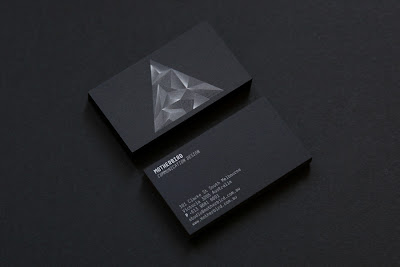
Business Cards

I am experimenting with the idea of re-branding myself, keeping the logo, but producing new stationary (business cards, mailers etc) and possibly redesigning my website when I get the chance although that may have to wait a while.
When I stumbled upon these beautiful cards from the Australian design studio, Motherbird. White on black looks so striking!

Tuesday, 24 August 2010

Great design

"Great design does not come from great processes, it comes from great designers"
Fred Brooks.


Re-blogged from SwissMiss.

Thursday, 12 August 2010

Birthday cards

Here are two birthday cards I have designed recently for my sisters' birthdays.
You may notice they both use Helvetica bold.

The first is my favourite of the two, based on a poster designed to promote Helvetica back in the 60's, it stacks the lettering and blocks in the V shaped counters of the Y in red creating an instant interest point. I am planning to screen print this card and have it for sale on Etsy soon.

The second is a lowercase dot to dot B which is a fun and unusual idea for a card, it can be completed or left alone. (This was the inspiration for my A B C pillows).


Tuesday, 10 August 2010

Notebook cover


Following my previous Notebook cover series, I have designed this cover which I am hoping to screen print and have for sale as full notebooks on Etsy in the coming months. The notebook may or may not be ring bound but the image above shows how the print will look.
It is also possible that I will print a few colour variations using ready mixed ink, so the possibilities of colour are totally random.

ilovebook.nl

Just stumbled upon this beautifully minimal website ilovebook.nl who sell the simplest, yet the most charming notebooks and diaries. Each uses little or no type on the covers which are available in different materials from kraft paper to leather.
Diaries feature stunning little calendars set in Helvetica in the deepest black colour. I want them all!
The books are all handmade creations from Dutch graphic designer Marjolein Delhaas.

Tuesday, 3 August 2010

Dot to dot to dot


A new set of pillows available to buy on my envelop shop. Each pillow makes up either the letter a, b, or c in lowercase Helvetica Bold. Join the dots to complete the image, or leave as is for an abstract designy feel.